Culinary Fusion Branding
A Geometric Culinary Experience
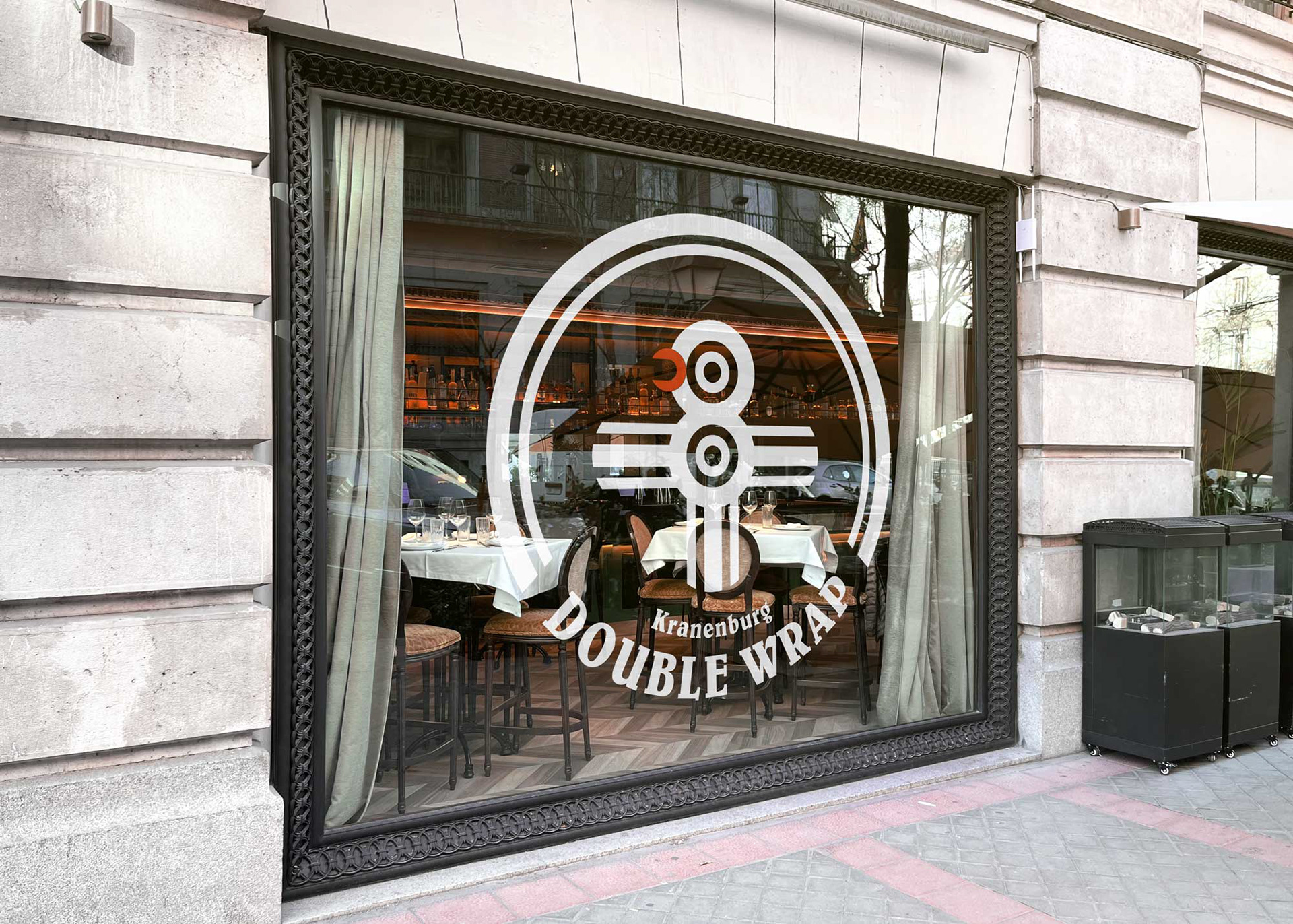
Double Wrap is a unique fast-food restaurant in Kranenburg, Germany, near the Germany-Netherlands border. It offers a visually captivating, health-conscious dining experience that will delight patrons. The brand identity is meticulous and captures the essence of the establishment, inviting customers to enjoy the unique culinary offering—the Double Wrap.
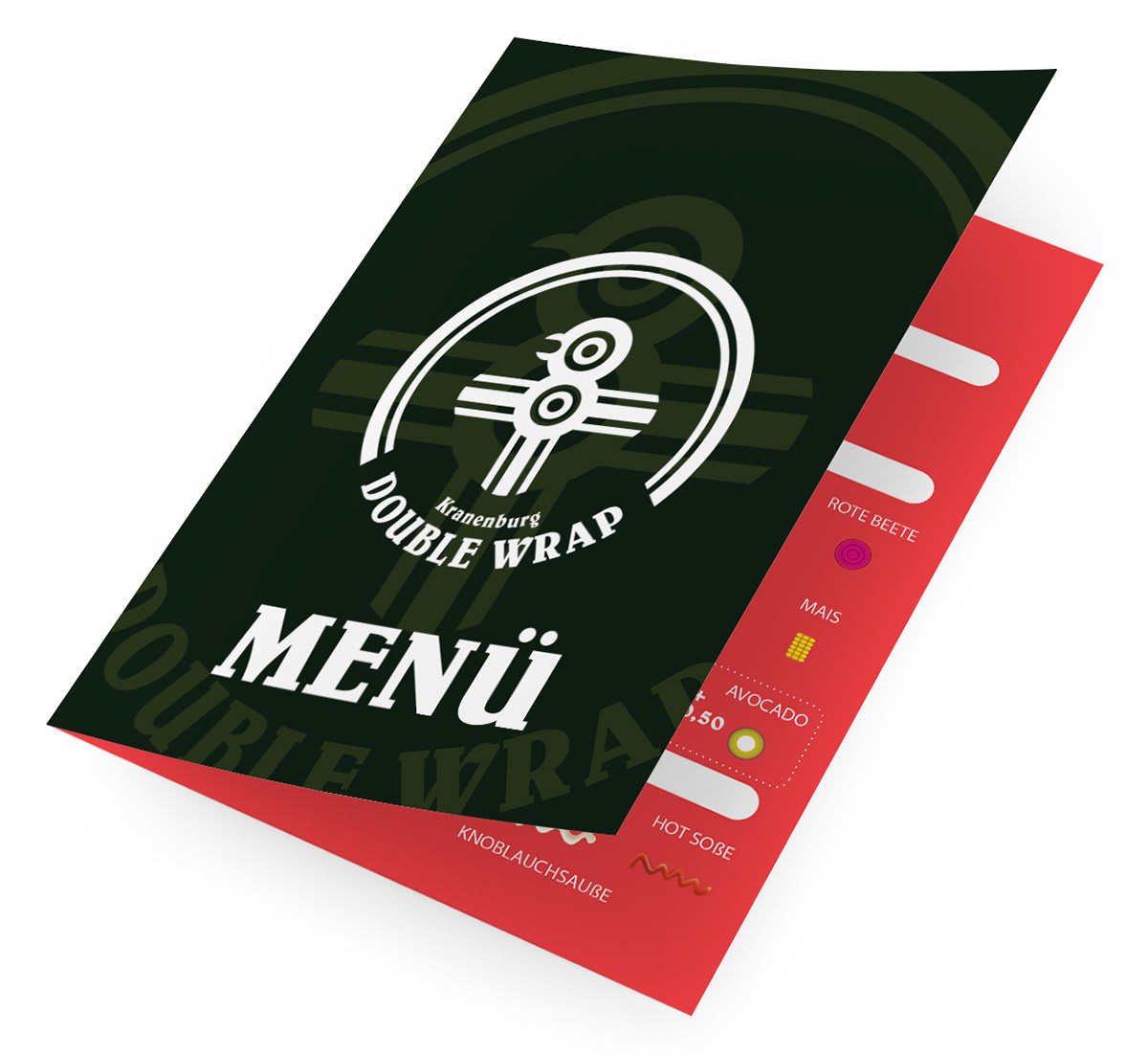
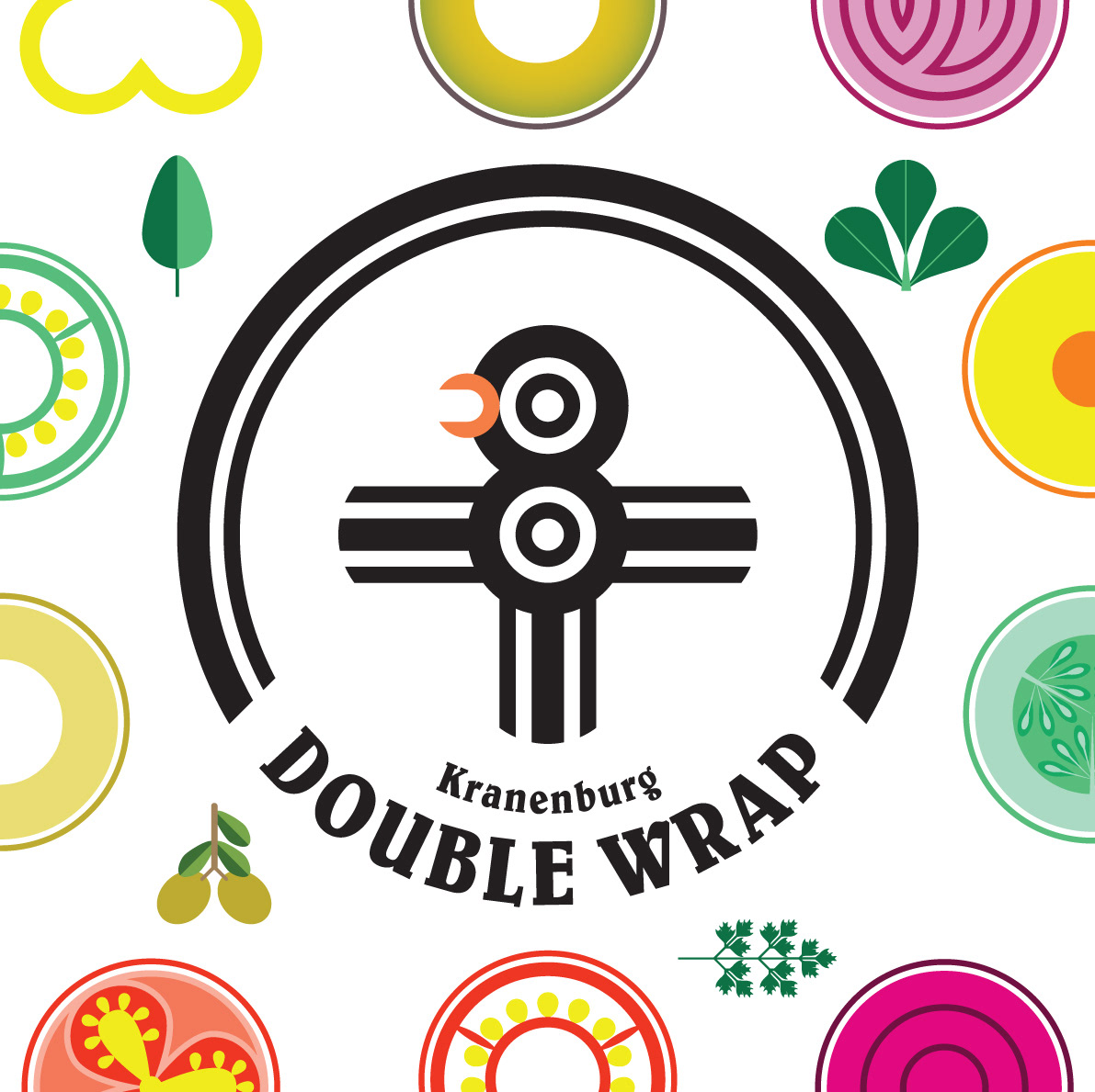
The logo of Double Wrap symbolizes the concept of swift and nutritious dining. It is a geometric representation of a chicken in a Mexican illustration style inspired by the natural construction of vegetables. Each slice and angle signifies the freshness and readiness of the ingredients, encouraging customers to savour every bite of the Double Wrap.
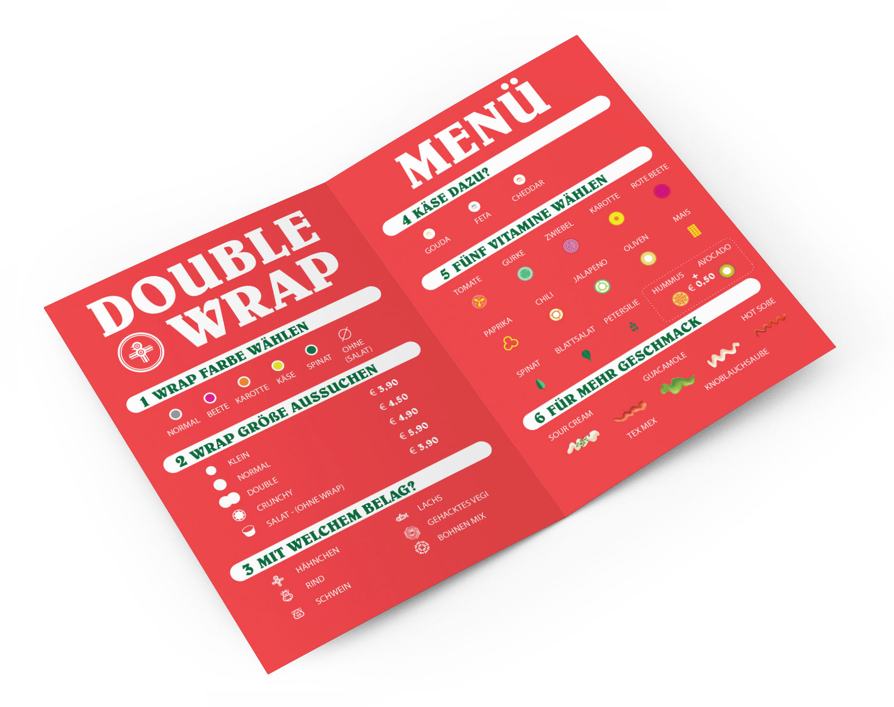
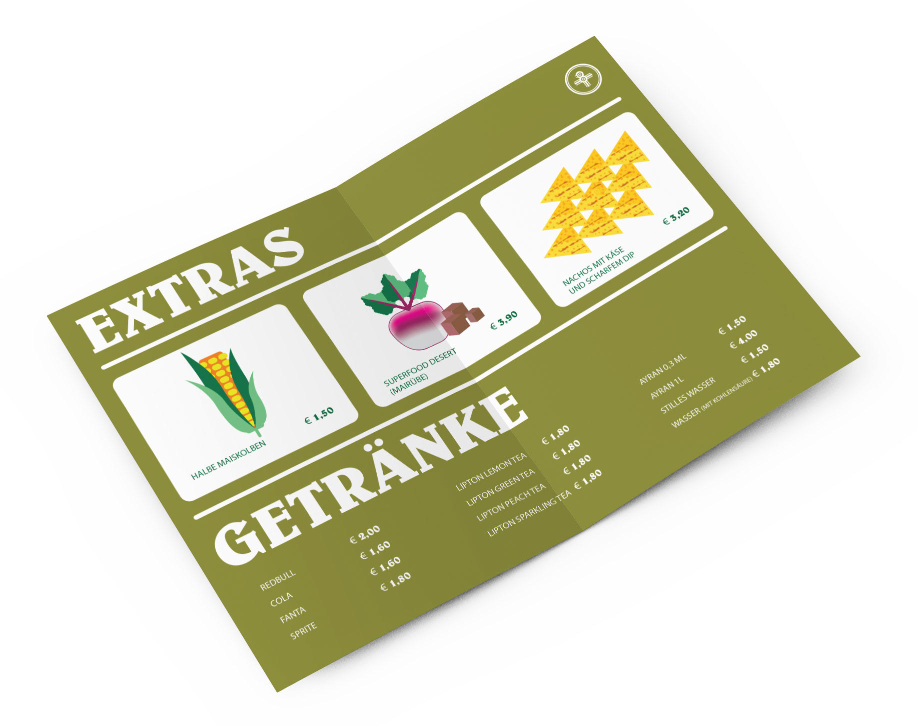
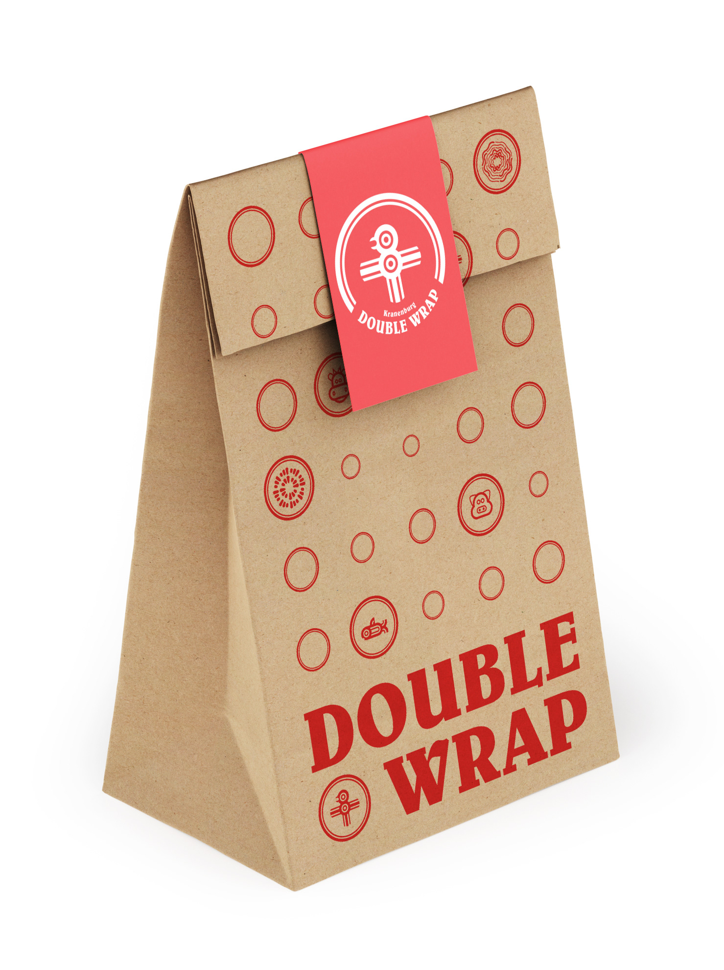
The restaurant's menu is adorned with the same geometric illustrations as the logo, making it a visual feast. Customers can enjoy the vibrant illustrations that promise a culinary adventure that is not just delicious but also visually stimulating. The brand identity seamlessly integrates into every facet of the restaurant, from the staff's clothing to food packaging, creating a unified and memorable visual experience for Double Wrap.
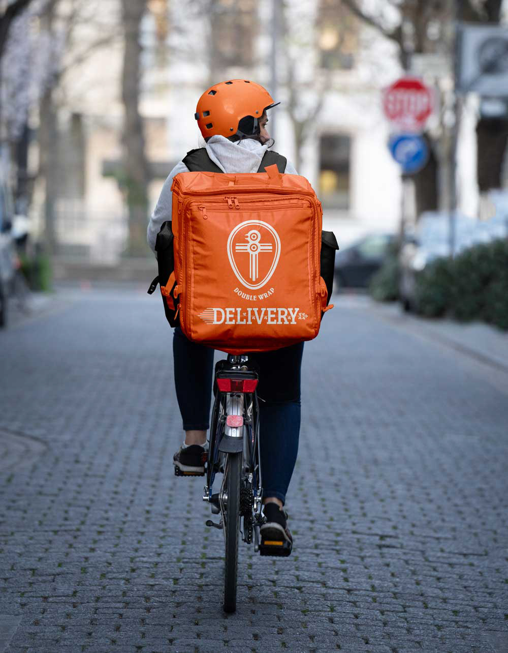
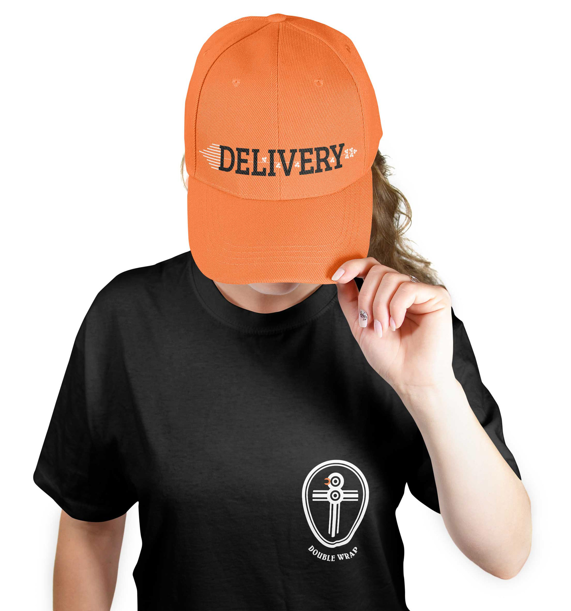
Even the delivery variant of the original logo ensures that every detail reflects a commitment to quality, enhancing the celebration of the restaurant's star offering. Double Wrap isn't just a fast-food spot; it's a geometric celebration of flavour, health, and the joy of indulging in the unique Double Wrap experience.
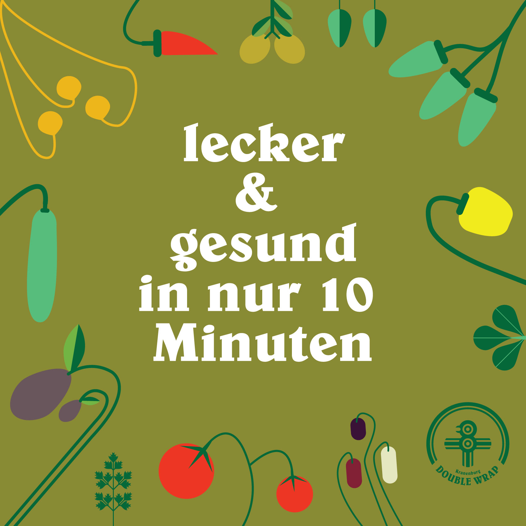
The design elevates the dining journey, making Double Wrap an essential destination for locals and passing cyclists seeking a refreshing and nutritious break.
The logo of Double Wrap symbolizes the concept of swift and nutritious dining. It is a geometric representation of a chicken in a Mexican illustration style inspired by the natural construction of vegetables. Each slice and angle signifies the freshness and readiness of the ingredients, encouraging customers to savour every bite of the Double Wrap.
The restaurant's menu is adorned with the same geometric illustrations as the logo, making it a visual feast. Customers can enjoy the vibrant illustrations that promise a culinary adventure that is not just delicious but also visually stimulating. The brand identity seamlessly integrates into every facet of the restaurant, from the staff's clothing to food packaging, creating a unified and memorable visual experience for Double Wrap.
Even the delivery variant of the original logo ensures that every detail reflects a commitment to quality, enhancing the celebration of the restaurant's star offering. Double Wrap isn't just a fast-food spot; it's a geometric celebration of flavour, health, and the joy of indulging in the unique Double Wrap experience.
The design elevates the dining journey, making Double Wrap an essential destination for locals and passing cyclists seeking a refreshing and nutritious break.