Community Federation Branding
Unity in Diversity
Unity in Diversity
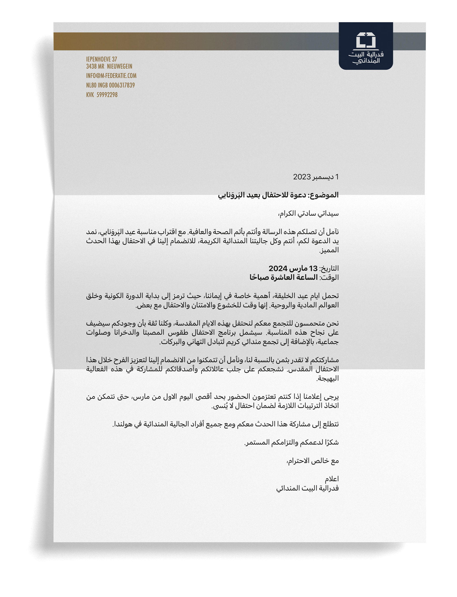
The Mandaische Huis Federatie is in the Netherlands and represents the Mandaean temple and its affiliated associations. It is vital in promoting Mandaean culture, tradition, and community bonds. The Mandaean community in the Netherlands is diverse, with two main groups: those who speak Dutch and those who communicate in Arabic, particularly the older generation. To ensure outreach to both linguistic communities, the federation embarked on a journey to establish a comprehensive multi-script branding identity.
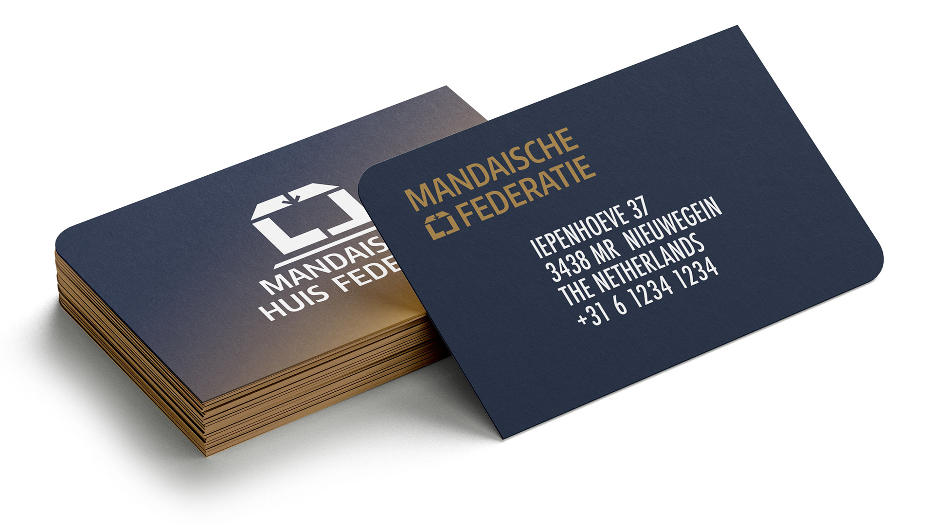
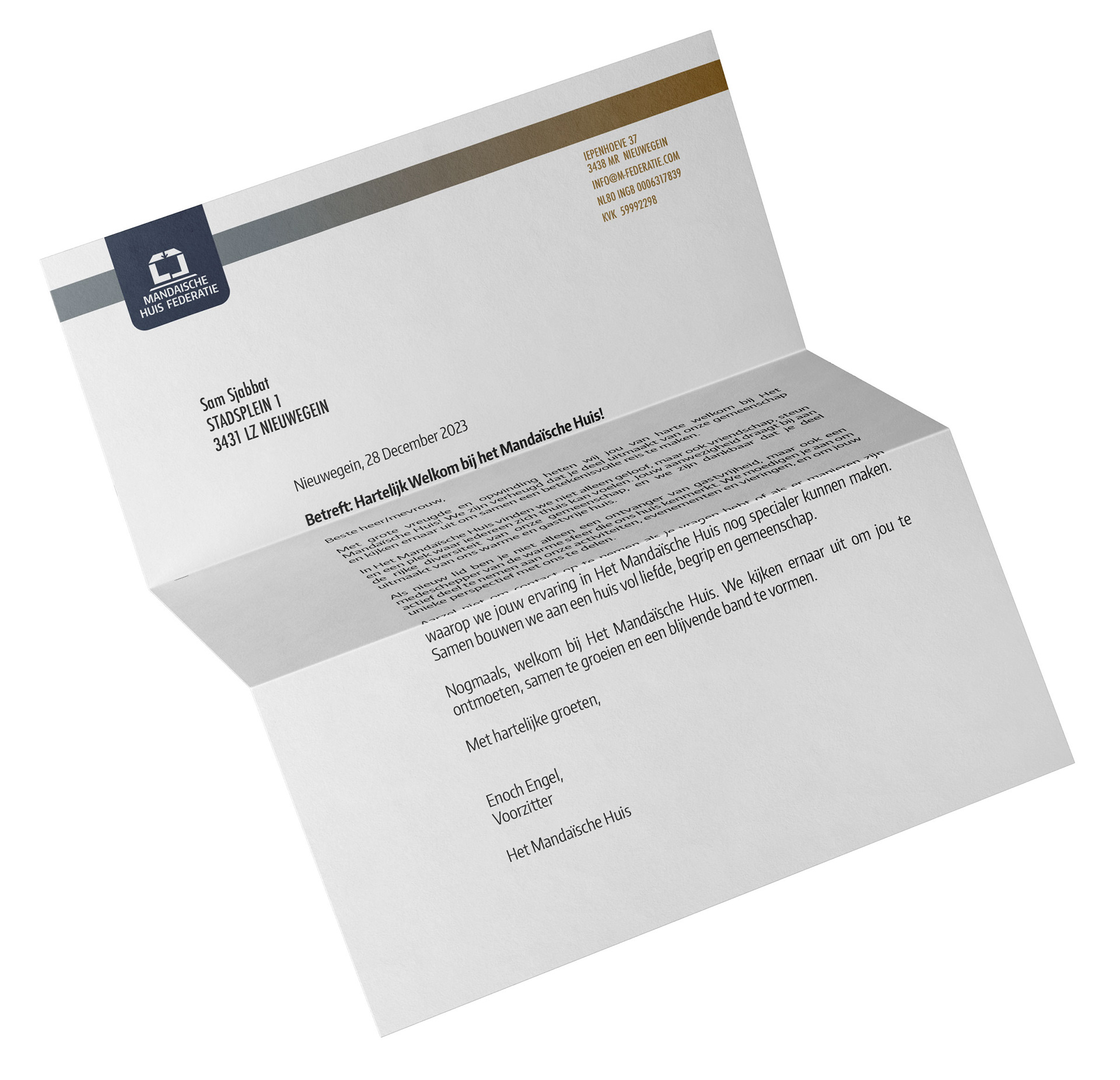
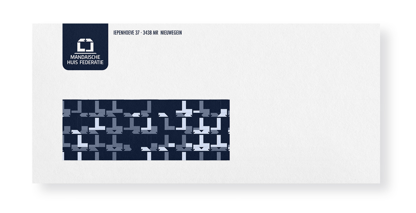
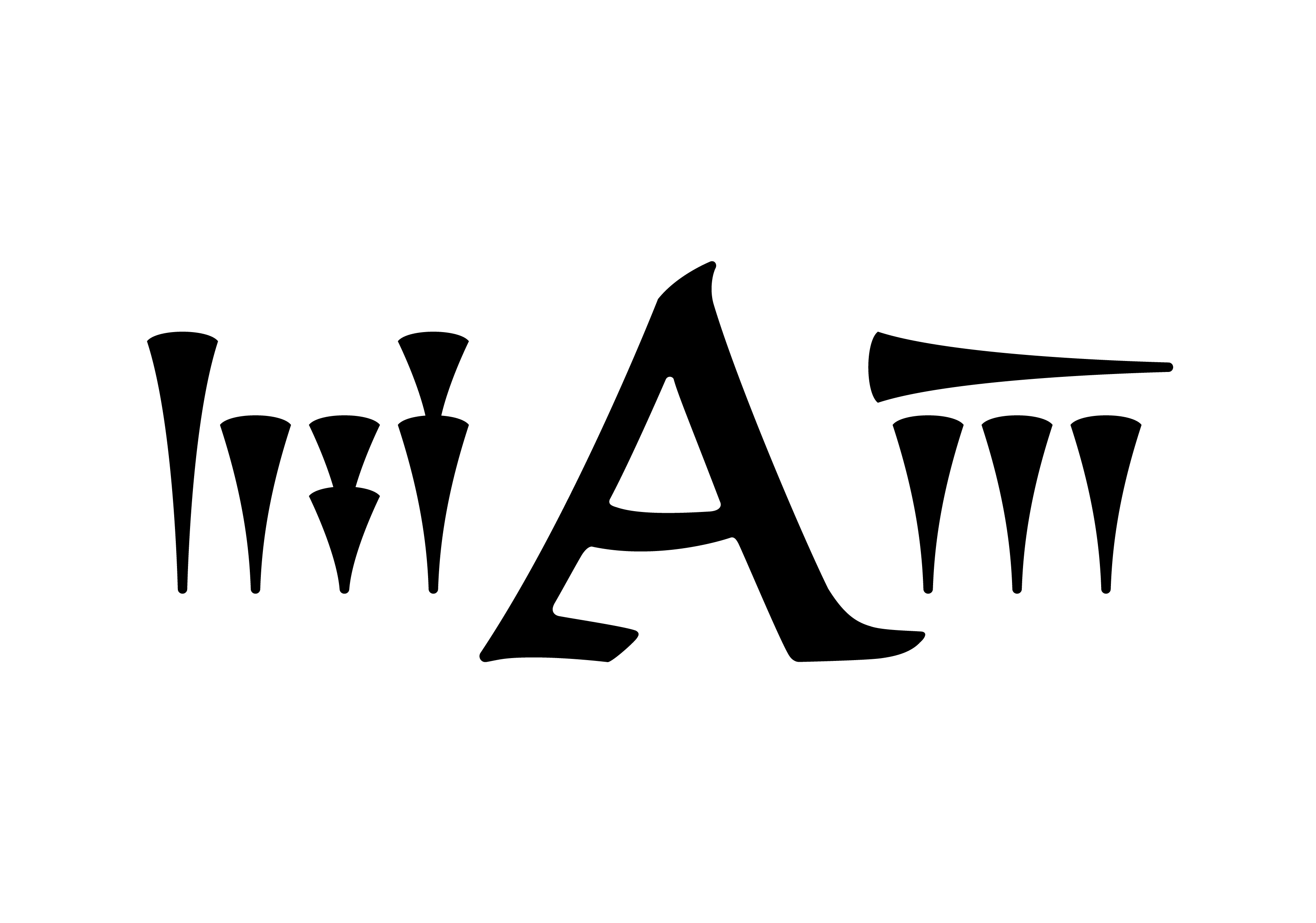
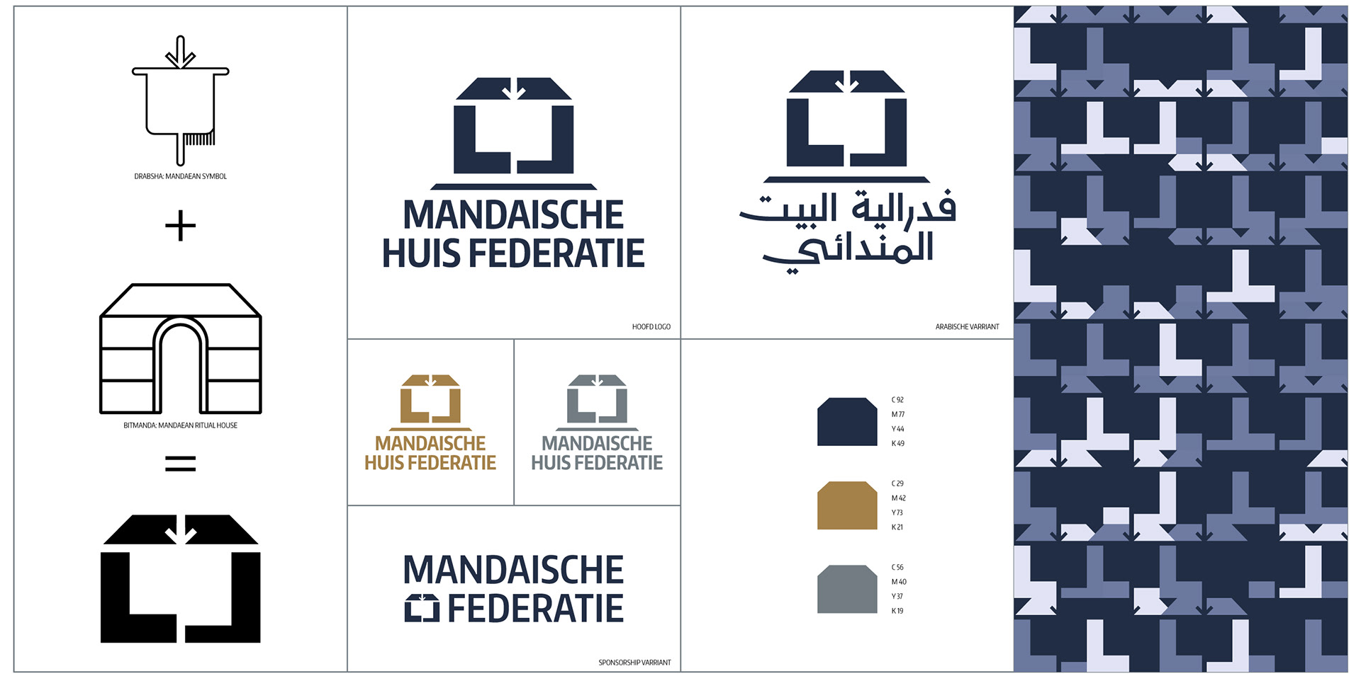
This initiative involved various elements necessary for effective communication and cohesion. A logo was crafted, inspired by the Mandaean cult hut and featuring the symbolic "Drabsha" banner cutout. The logo ingeniously splits the hut into four pieces, forming the Mandaean house while embodying the essence of a federation—a unity of distinct elements.
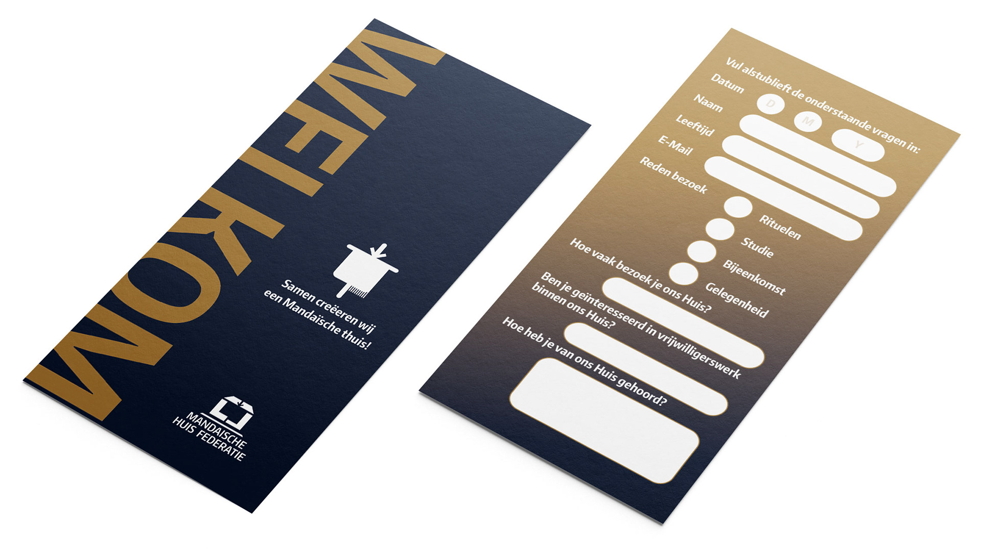
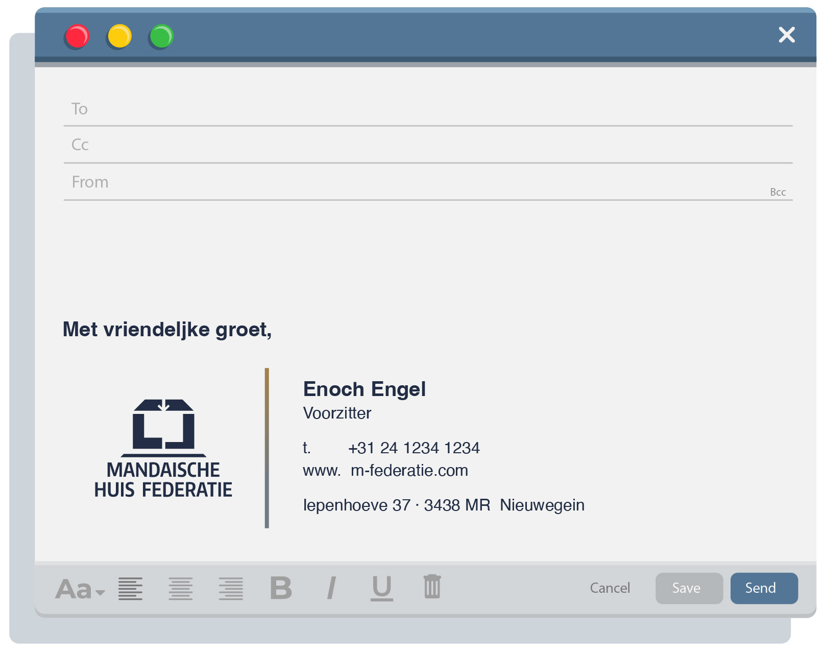
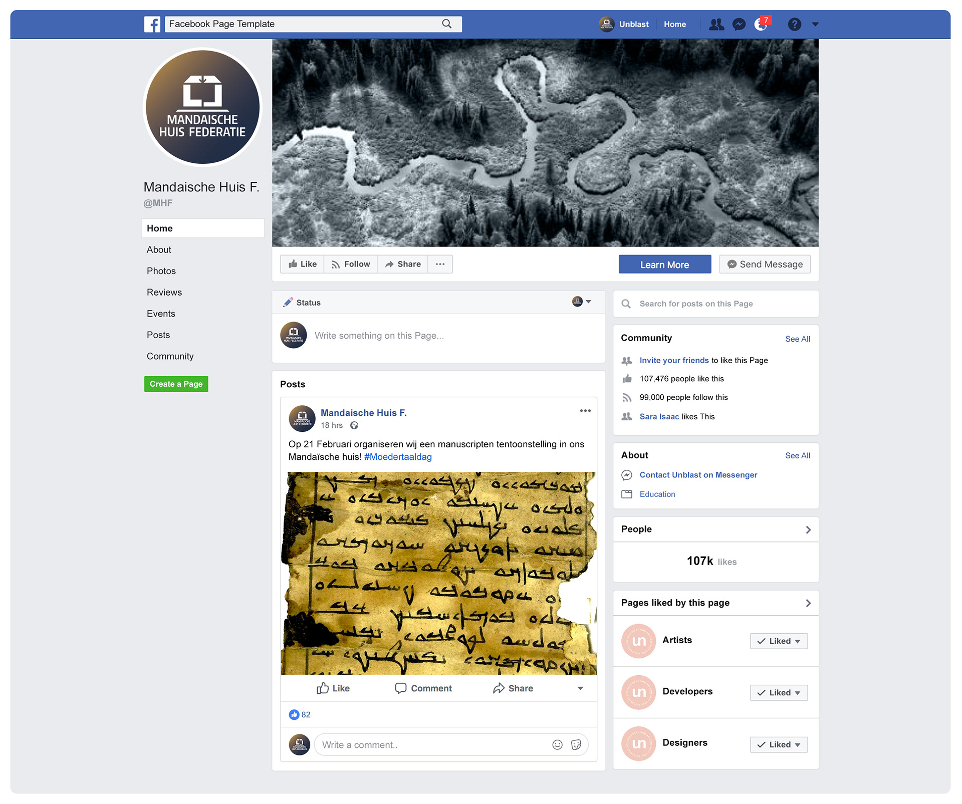
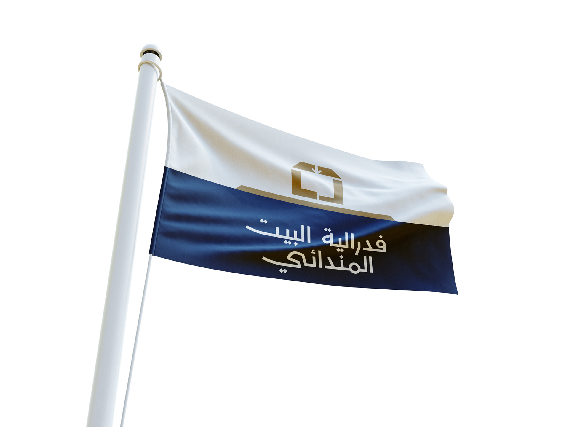
In addition to the logo, the branding extended to a flag, business cards, letterhead, envelopes, welcome forms for new visitors, email signatures, and logos with a corresponding colour palette for social media platforms. Each component was meticulously designed to serve the diverse functions of The Mandaische Huis Federatie, creating a visual language that resonates with the cultural, religious, and educational dimensions of the community.
This multi-script branding initiative is not just about aesthetics; it is a testament to The Mandaische Huis Federatie's commitment to fostering unity and inclusivity. The logo encapsulates the harmonious coexistence of religious ceremonies, cultural events, and educational gatherings within the sacred space of the Mandaean house. It is a visual beacon, guiding the community through the rich tapestry of shared experiences and collective identity.