
THE
LETTERARCHITECT
"I did not come to the manuscripts. I grew up inside them."
The Mandaic script was never a subject I chose. It was already in the house when I arrived, older than me, long before I could read it. I was born in Baghdad in 1987, into a family that has carried the Mandaean priesthood for twenty-four generations, and what others study from a distance was, for me, the air of childhood. Only later, at the art academy, did the letters turn from inheritance into architecture: a system with its own logic, its own proportions, its own way of standing.
Trained as a graphic designer and typographer at St. Joost School of Art & Design, I work where very few can stand at once: in priestly knowledge, in typographic craft, and in original research into one of the world's oldest and least understood scripts. Western scholarship has described this script from the outside for three centuries. I work from the inside, reading its letters as living forms rather than as signs, knowing them the way you know a house you grew up in rather than one you are shown through.
Much of what I have made is used every day without my name on it. The typography, structure, miniatures and typefaces of the Ginza d'Hiia are mine; so are the corrections to the Mandaic Unicode block, the standard that shapes how the script appears on every computer, and the contribution to the Mandaic keyboard on Apple's iOS and iPadOS. In 2019, at the Bibliothèque nationale de France, I was, as far as I know, the first Mandaean in four centuries to open the 1561 Ginza, the oldest surviving copy.
Two volumes are in preparation, the result of more than a decade of work on the cosmology and the history of the Mandaic script. They take up, from the inside, a question that three centuries of Western scholarship have refined without resolving. Until they appear, what can be said is written, week by week, on this site.
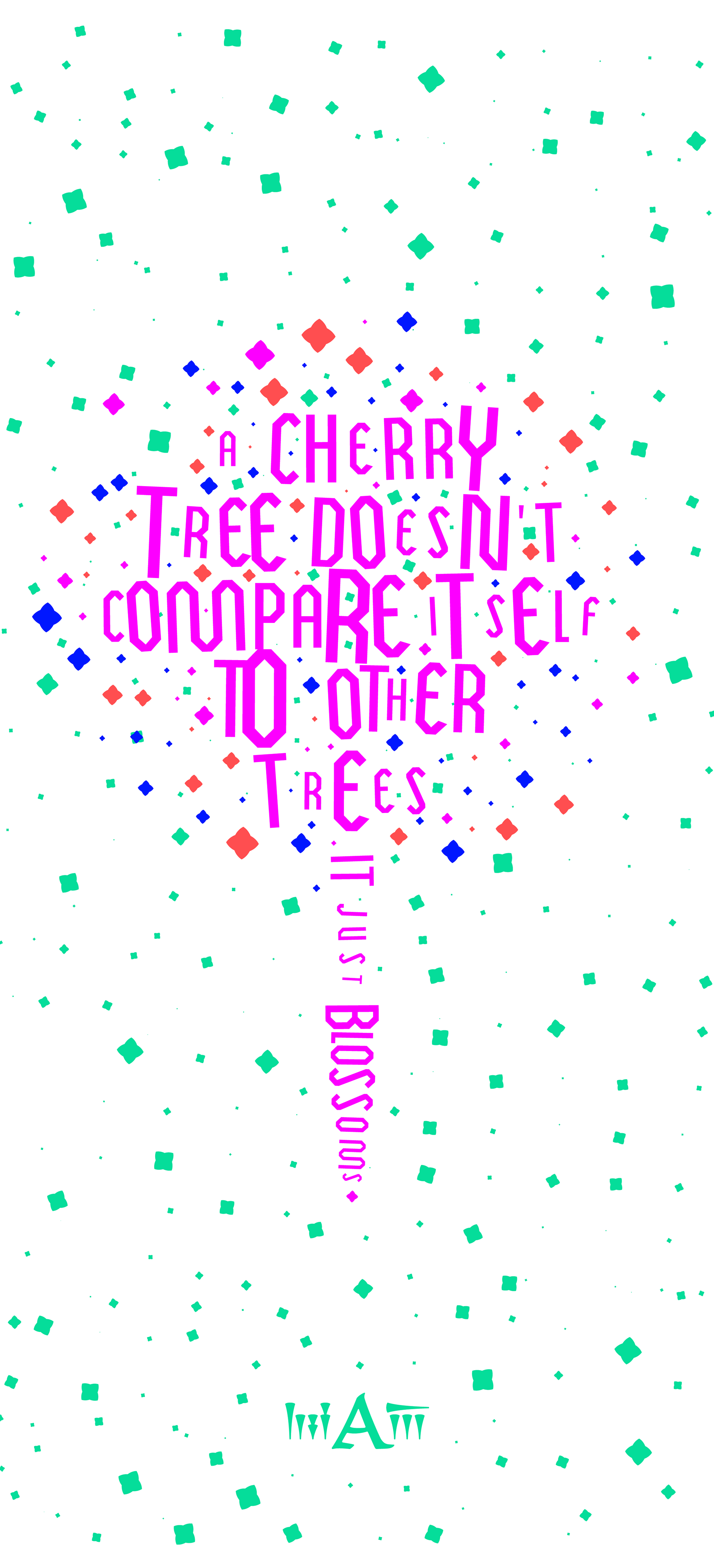
A letterarchitect does not design buildings. He re-engineers the script in which buildings are thought.
"In every respect, clarity, legibility, fidelity to the script, and sheer aesthetics, Al-Sabti's work is superior to the original. A model typeface." Prof. Charles G. Häberl, Rutgers University
"He moves beyond the assumption that writing is a linear, parallel and sequential form, and instead sees the page as an entire field for design." Tim Brookes, Endangered Alphabets Project