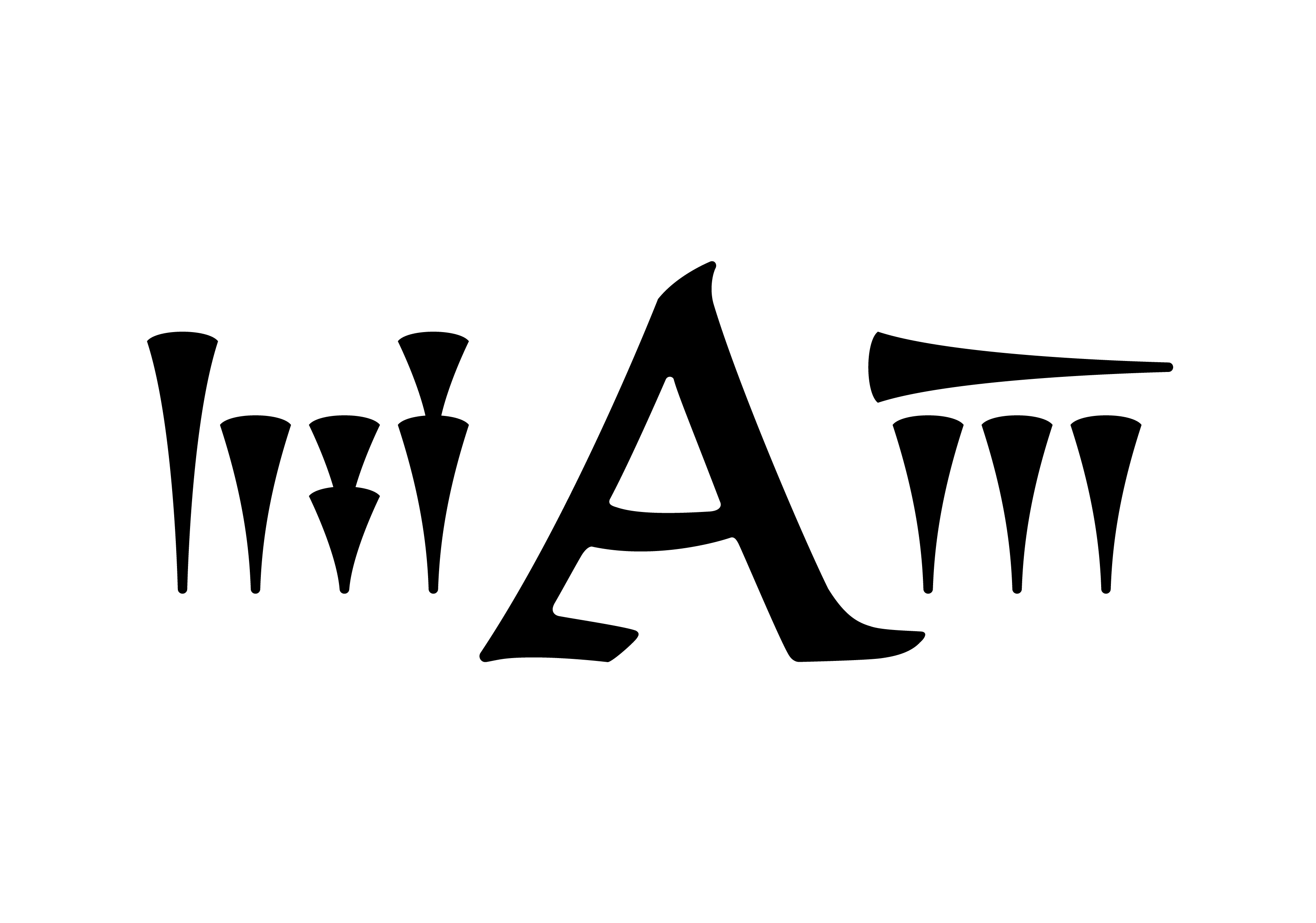

A little over a century ago, Mark Lidzbarski did something extraordinary: he translated the great Mandaean books into a Western language for the first time, and to do it he wrote a great deal of Mandaic out by hand. For many later readers his hand became, in effect, the face of the script.
In 2018 I was asked to turn that hand into a working digital typeface, for a scholarly edition of the Mandaean Book of John. I was given the chance to do it properly, which meant going all the way back to Lidzbarski himself.
For every single letter I gathered as many variants as I could find in his writing, because no two were ever quite the same. He wrote with different pens, different thicknesses, different angles, sometimes within one book. I traced each variant by hand, not to copy it but to feel the movement that made it, the direction and the pressure of his pen. Then I laid the tracings over one another, many versions of one letter stacked into a single cloud, until the ideal form, the one he seemed always to be reaching for, rose out of the overlap. Where a letter is built from two strokes, I overlaid each stroke on its own.
Only then did I study the pen itself, the tool he actually wrote with. And I found something quietly satisfying: in the places where he had not fully respected what his pen wanted to do, honouring it made his own letters a little more elegant, a little more themselves.
How those distilled forms were then fitted into proportion, and how they were programmed, belongs in my book. I will only say, to give a sense of the work, that covering all of Lidzbarski's ligatures meant drawing and building close to five hundred separate shapes.
The result keeps the character of his handwriting and improves its legibility. It was used to set the Mandaic in a scholarly edition of the Mandaean Book of John, published by De Gruyter in 2018. The book puts it in its own pages, more generously than I would put it myself:
"The Mandaic text in this book was set in the font Ardwan Lidzbarski, the forms of which preserve characteristics of the handwriting of its pioneer translator, Mark Lidzbarski, but improve upon their legibility. Ardwan Alsabti designed the font for this edition of the Mandaic Book of John in 2018, after careful study of the original manuscript."
The edition credits it under the name it carried then, Ardwan Lidzbarski. I have since renamed it Ardwan Script, which sits better with the direction my work has taken. The font is mine, and scholars use it under license. I did not set out to correct a great scholar. I set out to listen to his hand closely enough to give it back, clearer than he could leave it.
That, too, is what a letter architect does.