
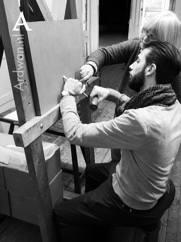
Cutting my first letters in stone. Cardozo Kindersley Workshop, Cambridge, 2014, with Lida Lopes Cardozo Kindersley.
Most lettering today is made for screens, where nothing is final and everything can be undone. I spend my working days at the other end of that. I design letters that will be cut into stone and read for a hundred years. The rules are different there, and stone is an unforgiving teacher.
Here is a fact that unsettles even Mandaeans: our script was never, historically, carved in stone. The Mandaic you now see cut into a gravestone is a thing of our own century, not an ancient practice. Why that is, and what it means, belongs in my book. It is enough to say that it is new, and that doing it well is a discipline of its own.
To put that in scale. Latin has two millennia in stone. Every optical rule that governs how a Roman letter behaves at scale, in raking light, from a fixed reading distance, has been tested and taught since the Trajan column. Mandaic has about three decades. There is no Trajan column for our script, no Renaissance revival to lean on, no twentieth-century codification. The rules that make Mandaic hold up in stone are being written now, and I am among the handful of designers writing them. This is not a boast. It is the accurate description of the position, and it changes how you approach every job. You are not applying a settled discipline. You are recording one, stone by stone.
The first question in stone is not beauty. It is distance. You do not read a headstone the way you read a page, or a street sign you pass on a bicycle. You stand still in front of it, a metre and a half to two metres away, and you read slowly. So the letters cannot be too small. As a rule of thumb we size the smallest text from the distance a visitor will stand at: at two metres it lands around eighteen millimetres; in some Dutch cemeteries, where the plot is longer and you stand back closer to two and a half metres, we move up toward twenty-five. That minimum is for the dates, or a line of scripture. The name is given more.
Which brings the second question: what should the eye meet first? On a Dutch stone the order is usually the first name, then the surname, then the dates, then any religious heading or personal words. You build that order into the sizes, so the eye is led rather than left to wander.
Height is only half of it. Thickness matters just as much. A stroke, or a small symbol, needs to be at least about two millimetres thick to hold and to read; and where two colours meet, you leave at least two millimetres of stone between them, or they bleed into one another.
Then the making. I make the design on screen. Once it is approved, it is prepared for production and a stencil is cut from it in plotting film. In the workshop, the film is measured onto the stone with great care, and the stone goes into the sandblaster, or the letters are cut by hand. The sandblaster does something simple and forceful: it fires a jet of fine grit at high pressure against the surface. Where the film protects the stone, nothing happens; where the letters are left open, the grit eats the stone away, cutting them down to an even depth. After that the letters are painted, sometimes in several layers, depending on the colour and the kind of natural stone.
The part I care about most is the spacing, and this is where the words "optical correction" come in. Letters are not boxes. An O, or an open A, L or T, carries far more apparent space around it than a straight pair like H or N. If you space letters by equal, measured gaps, the word comes out lumpy: the spaces around the round and open letters yawn, the straight ones crowd, and the eye trips on the rhythm. So you space by eye instead. You adjust each gap until the white between the letters looks even, until the line reads as one calm rhythm rather than a row of separate signs. That is optical spacing, and it is the difference between lettering that looks composed and lettering that looks merely assembled.
None of the optical rules I lean on come from a Mandaic tradition. They come from Latin, from Aramaic in a few cases, and from what I have learned by writing Mandaic myself. That means every job is also a small research project. One example, particular to our script. Mandaic is dominated by round forms. The ࡀ [A], the first letter of the alphabet, is essentially a circle, and several other letters carry curved bowls that live near the same shape. When a round meets a straight vertical, like the ࡆ [Z], the rhythm you saw on screen tends to collapse in stone. Take a word like ࡀࡆࡉࡆࡀ [AZIZA]: that collision appears twice within a single line, once on each side of the central ࡉ [I]. The eye reads the vertical as sharper and closer than the curve, which reads as receding. In raking daylight, that mismatch turns a balanced word into a leaning one. So I widen the space around the vertical, or thicken the round on the stroke that touches it, to hold the two shapes at the same visual distance. That correction has no name in any book. There is no manual to hand a stonemason. It is one of the small decisions Mandaic asks of me on every stone I design.
And that word, ࡀࡆࡉࡆࡀ, is where I stopped taking optical spacing for granted. We all treat it as a problem you solve once: even out the white, fix the gaps, done. But a gravestone is not read once. It is read across a day, in daylight that moves, and a V-cut is not a flat mark. It is an incision with two walls and a shadow that shifts as the sun crosses. So the correction I set by eye at noon, when the cuts throw almost no shadow, is wrong by morning, when one wall of every stroke falls into shade and the round and straight forms darken unequally. The optically correct spacing of an incised inscription is not a fixed value. It is a function of the position of the sun.
I have not been able to find this idea in the literature I know. The parts are old. Optical spacing is a mature craft, and no one carried it further than David Kindersley, a letter-cutter who ran a workshop cutting gravestones. I work in the same trade, designing letters for stone, and I know the ground he stood on. He spent years trying to reduce the spacing of letters to a system, a formula that would find the correct gap on its own. He never closed it. The work he set down in the 1960s, reprinted again and again, records his workings rather than a finished method, and the system the trade went on to adopt was Walter Tracy's, not his.
In 2014, as a student, I visited his workshop in Cambridge, still run by Lida Lopes Cardozo Kindersley. It was there that I first cut letters into stone with my own hands, and there, as I always do, that I bought books.
I think his instinct was right and his category was wrong. He was looking for a fixed value, a constant that would settle the spacing once and for all, and he went looking for it with light: his experiments passed light through the letterforms to find where their weight truly sat. Light was his instrument for locating a constant. What I am claiming is that light is not the instrument. It is the variable. For a letter cut in stone there is no such constant, because the correct spacing is not a number at all. It is a function of the light.
The methods that did take hold say the same thing in their own way, by their silence. Tracy's system, and the ones built after it, treat spacing as a property of shape alone: sidebearings, counters, the white inside the letter weighed against the white beside it. The light that falls on the letter is never a term in the equation, because on a page it never changes. Reading the sun off a carved monument is its own discipline, archaeoastronomy, but the join, spacing itself as a function of solar position, is not in the literature I was trained in. I will not claim it is provably new, only that it appears to be, and that I would rather say that precisely than overstate it. The difficulty is that stone cannot prove it. Once a letter is cut, its spacing is fixed forever. The one material worth designing for is the one that cannot demonstrate a spacing that moves with the light.
Solar light spacing: the optically correct spacing of an incised inscription as a function of solar position. Simulation, Ardwan Al-Sabti, 2026.
So I built the proof where it can live, in a simulation. It moves a sun across ࡀࡆࡉࡆࡀ in my own letterforms, from 06:00 in the east to 18:00 in the west, and lets the shadows relight and the outer letters shift by exactly what the changing light demands, in mirror symmetry around the fixed centre. A red under-layer shows the correction being asked for. At noon, when the shadows are least, the red vanishes: the word is already spaced right. Toward sunrise and sunset it separates, and you see the pull. It runs the archaeoastronomer's method in reverse: instead of reading a date off a fixed monument, it computes the spacing a monument would need to look right at a chosen hour.
That noon reading is not the true value with the other hours as deviations from it. It is the one hour at which the light happens to say nothing, and nobody stands at a grave only at noon. A stone is read across the whole day, and in augmented reality there is no noon at all: the light can come from anywhere. Take away the sun's single midday position and the constant Kindersley was looking for has nothing left to stand on.
I have given it a name, because naming a thing is how you take responsibility for it. Solar light spacing. Flat screens cannot show it, and perhaps no surface needs it yet. But augmented reality will put lit, three-dimensional letters in space one day, and when it does, spacing that ignores the light will look wrong. I am writing it down now, with a name and a date, so it is findable when that day comes.
I did not learn this from a handbook. I learned it on the job, designing for stone day after day, for work that will outlast me. Most of what I make will be read fifty and a hundred years after I stop breathing. That is a different design brief than a screen or a print run. It changes what you rush and what you slow down. It is the same care I give to the script; only here a mistake is permanent, and a good decision is inherited.